Textile, Styling & Care
Choosing Decorative Pillow Covers by Texture, Scale, and Use
A considered pillow arrangement is less about adding more and more about finding the right contrasts. Texture gives a room depth, pattern scale sets its rhythm, and thoughtful choices about use and care make the whole composition feel effortless.
Decorative pillows are among the most adaptable elements in a room. They can soften the straight lines of a sofa, bring a bedroom palette into focus, or introduce a small but satisfying change of mood without asking for a full redesign. Their covers matter as much as their color: a nubby weave, a relaxed linen surface, or a crisp stripe can alter the way a space feels before the eye has even registered the details.
The most successful pillow covers balance appearance with purpose. A cushion used every evening needs a surface that can withstand regular contact and a cover that is straightforward to clean. A pillow placed on a bed for occasional display can invite a more delicate finish or a bolder pattern. In either case, choosing well begins with a few practical questions: How will the pillow be used? What size and shape is the insert? How will its fabric relate to the room’s other textiles? And what care will it need?
Think of the arrangement as a small study in proportion and touch. A restrained palette can feel richly layered when its textures vary; a pattern can become a focal point when its scale is balanced by quieter companions. The aim is not perfect uniformity. It is a composition that feels intentional, comfortable, and entirely at home.
Begin with the life of the pillow
Before considering color or pattern, decide what the pillow is expected to do. This simple step narrows the field and prevents a beautiful cover from becoming an impractical choice. Decorative pillows often move between roles: one may be a finishing accent by day and a backrest during an evening on the sofa. Others remain arranged on a bed, lending shape and polish to the room but seeing little direct use.
For pillows that receive frequent handling, look for a sturdy fabric and a construction that can tolerate routine laundering. A closely woven cotton or linen, a durable blend, and secure seams are often sensible choices for busy living spaces. Covers used by children or pets may benefit from darker or more forgiving colors, washable materials, and patterns that disguise everyday marks. This does not mean that practicality must flatten the design. Texture, scale, and subtle color shifts can create interest even in a hard-working textile.
For occasional accents, there may be more room to prioritize a distinctive finish. A pronounced slub, a decorative stripe, or a softer, more tactile weave can contribute character where the pillow is handled less often. Still, check the care label before committing. “Decorative” does not automatically mean delicate, and an elegant-looking cover may require more maintenance than the household routine allows.
Consider where the pillow will sit, too. A cover on a sofa arm may rub against clothing and receive more friction than one placed at the center of a bed. On a reading chair, support and comfort matter; a stiff, heavily embellished surface may be less inviting than it looks. In a bedroom, a sham designed to coordinate with bedding may be intended primarily for arrangement, while a pillow cover used for lounging should feel comfortable against the skin. The right choice responds to the room’s habits, not simply its photograph.
Texture: the quiet source of depth
Texture is the element that allows a restrained scheme to feel layered rather than sparse. Smooth fabric beside a more tactile weave creates contrast without introducing another color. A matte linen surface can offset a softly lustrous textile; a compact plain weave can make a relaxed, visibly textured cushion feel all the more distinctive. These differences are subtle, but they give the eye somewhere to linger.
Linen is especially useful in this kind of composition because its character is visible. The natural variation of the yarn, the irregularities of the surface, and the way the cloth relaxes over time lend it an unfussy presence. A washed finish tends to feel more casual and supple, while a denser or more structured cloth may read as tailored. Neither is inherently better: the choice depends on whether the room calls for ease, definition, or a balance of both.
When combining textures, think in terms of contrast rather than collecting every tactile effect at once. Two or three distinct surfaces are usually enough for a small arrangement. Pairing a relaxed linen cover with a smooth cotton cushion and a woven throw, for example, creates variation while keeping the composition legible. If every item has a pronounced weave, fringe, embroidery, or raised detail, the arrangement can feel restless. A quieter surface is often the most elegant companion to a more expressive one.
Texture also affects how color appears. A rougher weave scatters light differently from a smooth one, so two covers in nearly the same shade may not look identical. This can be an advantage: tonal layering can add dimension without relying on strong contrast. When matching neutrals, compare the actual fabrics in the room’s natural light if possible. Undertones that seem aligned in a product description may diverge beside a warm wood floor or a cool-toned duvet.
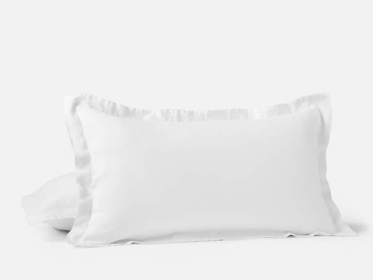
For a calm, tactile bedroom, a simple linen sham can provide a useful foundation. The Organic Relaxed Linen Sham, for example, is made from organic French linen woven in Portugal and is sold individually. Its breathable, relaxed character suits a bed arrangement where natural texture is more important than a bold motif. As with any bedding textile, check the dimensions and care guidance before deciding how it will work with the pillows you already own.
Pattern scale: create rhythm, not competition
Pattern is most persuasive when its scale is considered in relation to the other elements nearby. A large motif has a different visual weight from a fine stripe or a tiny repeat. If every pillow carries a pattern of similar size and intensity, the arrangement may lack hierarchy. If patterns vary in scale, each can be seen more clearly, and the group feels composed rather than crowded.
A useful starting point is to select one dominant pattern, then support it with a smaller-scale design and a solid or subtly textured cover. The dominant pattern might be a broad stripe, a generous botanical motif, or an abstract design. The smaller pattern can provide a finer rhythm without trying to take center stage. A plain cover—though not necessarily a featureless one—gives the eye a place to rest.
Scale should be judged on the finished pillow, not just on a fabric swatch or screen. A pattern that looks intricate when viewed closely may become a gentle texture from across the room. Conversely, a bold repeat can occupy most of a small cushion and feel more graphic than expected. Pillow size affects the reading of a motif: a large print may be beautifully proportioned on a broad cushion but cramped on a small square cover.
Stripes are particularly versatile because they can behave like either a pattern or a structural line. A narrow stripe often feels quiet and tailored; a wide stripe makes a clearer statement. Direction matters, too. On a square pillow, a horizontal stripe can emphasize width, while a vertical arrangement may bring a subtle sense of lift. If mixing stripes with another motif, let one be clearly more prominent. Two competing stripes may look more deliberate when their widths or spacing differ noticeably.
Color is the thread that ties pattern scale together. Repeating one shade across different prints can make variety feel cohesive. A muted blue in a stripe, for example, might reappear as a minor note in a botanical pattern, with a natural or cream ground connecting both. The repeated color need not match exactly; a related family of tones often feels more relaxed than a perfectly coordinated set.
- Choose a lead: Give one cover or pattern the strongest visual presence.
- Vary the scale: Combine a larger motif with a finer pattern or an understated texture.
- Repeat a color: Let one or two shades recur to connect the arrangement.
- Leave breathing room: Use a solid or quiet cover to keep the composition from feeling busy.
Proportion, shape, and the insert inside
A well-chosen cover begins with the pillow itself. Check the cover’s finished dimensions and compare them with the insert, rather than assuming that sizes described with the same label will fit in exactly the same way. A cover that is too small can strain the seams or distort the shape; one that is too large may look slack and lose definition. Some people prefer a fuller appearance and use a slightly larger insert than the cover, but the result depends on the fabric’s give, construction, and intended look.
Take note of shape as well as size. Square cushions are easy to layer and work across many settings, while rectangular lumbar pillows can break up a row of square forms and provide useful support. A round or unusually shaped pillow can act as a focal point, but it benefits from simpler companions. The more distinctive the silhouette, the less it may need help from a busy print.
Always confirm whether the cover includes an insert. Covers are frequently sold separately, and an attractive product description may refer only to the textile shell. If you already have inserts, measure them before purchasing. If you need new ones, consider firmness and fill as part of the intended use: a pillow for lounging may need different support from an accent placed upright on a bed. A cover’s fabric and closure should also be compatible with the insert’s fullness.
Arrangement is a matter of proportion, not arithmetic. On a sofa, a few larger cushions can create a strong foundation, with a smaller accent adding variation. On a bed, pillow layers often look best when their sizes step down naturally from the sleeping pillows toward the front. The scale of the furniture matters: a compact chair can be overwhelmed by oversized cushions, while a generous sofa may make tiny pillows seem incidental. Let the furniture set the scale, then use the covers to refine it.
Closures and construction: details worth noticing
The closure may be discreet, but it influences both appearance and everyday use. A zipper can create a clean edge and make removal straightforward, provided it is well finished and does not sit where it will scratch or catch. An envelope closure avoids visible hardware and can feel simple and relaxed, though the overlap should be generous enough to keep the insert neatly contained. Buttons or ties may add decorative character, but they also introduce details that can affect comfort and care.
Inspect the seams and the way the cover is finished. Strong, even stitching helps a cover retain its shape through regular use and washing. A carefully made edge can make even a plain textile feel polished. For pillows that will be leaned against, avoid prominent embellishment where the body rests. Raised trims, beads, or stiff embroidery may be beautiful but less comfortable on a frequently used cushion.
These details should be read together with the fabric. A delicate closure on a heavy cover may be a poor match for constant handling; a robust construction can help a softer fabric serve more practically. Consider whether the cover can be turned inside out before washing and whether its closure can be secured. Small habits like these can reduce snagging and protect both the fabric and the finish.
Care that preserves the surface
Fabric care is part of the design decision, not an afterthought. A cover that needs specialist cleaning may still be the right choice for a low-use accent, but it may be inconvenient on a family sofa. Read the care label before buying and follow the instructions for the specific textile. Fiber content, dye, finish, trim, and construction can all affect the appropriate method, so it is unwise to assume that every linen or cotton cover should be treated identically.
For washable covers, remove the insert first and check the closure. Wash similar colors together, use a suitable gentle detergent, and avoid overcrowding the machine so the fabric can move freely. If the care guidance recommends a cool or gentle cycle, treat that direction as part of the cover’s use requirements. Harsh bleach and overly aggressive washing can weaken fibers, alter color, or change the surface. When a stain occurs, address it promptly and test any cleaning approach on a discreet area if the instructions permit.
Drying also matters. Line drying can be a gentle option when practical, while a dryer may be suitable only at the temperature specified on the care label. Remove covers promptly if they are tumble-dried to limit creasing. Linen naturally develops a relaxed appearance, so a perfectly pressed finish is not always necessary. If you prefer a smoother surface, follow the textile’s ironing guidance; ironing while slightly damp is recommended for some linen fabrics, but the manufacturer’s instructions should take precedence.
Between washes, routine care can extend the intervals between laundering. Air pillows periodically, rotate them if they are used often, and address small spills before they settle. Store seasonal covers clean and completely dry, away from direct sunlight and damp conditions. A breathable storage location helps protect the cloth while keeping it ready for the next change in season.
Do not forget the insert. A clean cover cannot compensate for an insert that is misshapen or in need of care. Follow its own cleaning instructions, and allow it to dry thoroughly before putting the cover back on. This preserves the pillow’s shape and helps prevent trapped moisture from affecting the textiles.
Coordinate with bedding and throws
A pillow cover does not need to match the sheets, duvet, or throw exactly. In fact, a room often feels more considered when its textiles relate through tone, texture, or proportion rather than identical patterns. A pale linen duvet can sit comfortably with a striped cushion if they share a color family. A solid cover in a deeper shade can anchor a lighter bed, while a textured neutral can connect a patterned pillow to a plain throw.
Think about the whole surface. On a bed, covers are seen alongside sheets, shams, and blankets, so variations in weight and drape matter. A crisp, tightly woven textile may create definition against a soft, rumpled linen. In a living room, a cushion’s fabric can echo the texture of a throw without duplicating it. Repetition is useful when it is selective: a recurring shade, a repeated stripe, or a similar natural finish can make distinct pieces feel related.
Seasonal changes can be modest. Rather than replacing every pillow, switch one or two covers to alter the mood: a lighter shade or airier weave in warmer months, a deeper tone or more substantial texture when the room calls for visual warmth. Keep the rest of the palette steady and the transition feels deliberate rather than decorative for its own sake.
A practical checklist before choosing
When a cover catches your eye, pause long enough to check the details that determine whether it will work in your home. A few minutes spent comparing dimensions, fabric, and care can save the disappointment of a pillow that does not fit or a surface that is difficult to maintain.
- Use: Is the pillow for daily lounging, occasional support, or display?
- Composition: What fibers are used, and how might their texture and weight feel in the room?
- Dimensions: Does the cover suit the insert’s measurements and shape?
- Included items: Is the insert included, or is the listing for the cover alone?
- Pattern: Does its scale complement the other textiles rather than compete with them?
- Closure: Is it convenient, secure, and comfortable in the pillow’s intended position?
- Care: Can you maintain the fabric using the method and frequency your household requires?
These questions are not intended to make decorating feel technical. They simply bring the practical and aesthetic sides of a choice into conversation. Once the essentials are clear, the more intuitive decisions—whether a color feels right, whether a weave adds the desired softness—become easier to trust.
A more thoughtful finishing touch
The best decorative pillow covers earn their place in a room twice: first through the way they look, and again through the ease with which they are lived with. Texture lends depth, pattern scale creates a sense of rhythm, and suitable construction supports the pillow’s everyday role. Care completes the picture, keeping the fabric comfortable and attractive through repeated use.
Begin with a purpose, then build the arrangement gradually. Choose one cover that establishes the mood, introduce contrast through a different texture or pattern scale, and leave enough quiet space for each element to register. Check the fit and care instructions before deciding. With those foundations in place, even a small change—a washed linen surface, a measured stripe, or a softly contrasting neutral—can make a room feel newly composed without losing its ease.